A re-brand Concept
Re-thinking intensity through design.
I reimagined Monster Energy as a brand that promotes a cleaner, modern, and more wellness-friendly approach. Monster’s usual “in-your-face, adrenaline-pumped” vibe works for a niche crowd, but I wanted to explore what it could look like if it spoke to people who care about health, design, and lifestyle.
The purpose of this project is to demonstrate just how much impact branding has on a product. Without changing any of the information, ingredients and core offering - simply just playing with the visuals, we are able to speak and reach a whole new audience - this is the power of branding!
Let’s explore how I came to this conclusion!
monster energy

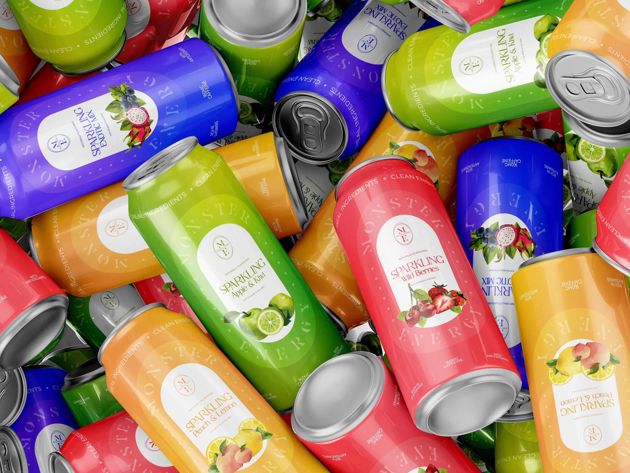
This conceptual rebrand of Monster Energy explores the powerful role design plays in shaping consumer perception. Known for its aggressive, adrenaline-fueled aesthetic, Monster often appeals to a niche audience - but what if it could speak to a broader, health-conscious, design-aware demographic?
This project flips the visual language of energy drinks, using restraint, balance, and elevated design to suggest a new kind of energy: clean, focused, and lifestyle-forward.
The goal was to prove that even a brand with a name like “Monster” can feel premium, fresh, and modern - with the right design system.
PROJECT OVERVIEW
Challenge conventional category norms (bold, chaotic, loud visuals).
Demonstrate how visual identity directly affects brand positioning and user trust.
Create a design that feels at home on shelves next to health drinks, wellness products, and functional beverages.
DESIGN OBJECTIVE

CORE DESIGN MOVES
1. Brand Strategy Shift
Moved from “extreme energy” to “controlled focus.”
Introduced a minimalist, lifestyle-first aesthetic to shift the audience perception.
Positioned the product as something that supports daily performance, not just high-octane moments.
2. Visual Identity Transformation
Logo: Redesigned with clean lines and simplified forms, stripping away the chaos.
Typography: Sleek, contemporary typefaces that suggest clarity and confidence.
Colour Palette: Replaced neon green and black with calmer, fresh tones.
3. Packaging Redesign
Hierarchy: Emphasised simplicity, with clear ingredient callouts and calming visual flow.
Texture & Form: Introduced matte textures, soft gradients, and subtle layout grids to evoke a premium, wellness-aligned experience.
Product Architecture: Reimagined the product line to include Focus, Hydrate, and Recharge - functional names with a calm, purposeful vibe.

Strategic Design Thinking: Shows a clear understanding of how visual systems impact user perception and marketability.
Category Disruption: Demonstrates the ability to rethink legacy brands through a modern, user-centric lens.
Product Design Mindset: Prioritizes clarity, usability, and emotional resonance, core to successful product design.
Why It Works (and Why It Matters)
Created a reimagined Monster brand that still carries energy, but more refined for a modern, wellness-driven world.
Showcased how subtle shifts in typography, colour, and form can completely reframe brand perception.
Proof-of-concept that even the most “intense” brands can evolve with the right design lens.
OUTCOME
THANK YOU FOR READING!
Wanna see what else I’ve been up to?