A UX/UI CASE STUDY
Droplet is a subscription management app that tracks recurring charges before they pile up. Little leaks add up - stop the drip & save your wallet.

How many times have you noticed a random €5.99 charge on your bank statement and thought, “Wait, when did I sign up for that?” Or maybe you’ve kept a “free trial” of a streaming service going for three months too long.
Subscriptions are designed to be sticky. Signing up is frictionless, but canceling feels like running a maze. Small drips of money turn into floods before you realise it.
Droplet was designed to stop that drip.
It gives users control over their recurring payments, helps them see the big picture, and makes canceling as satisfying as saving.
This is a conceptual freelance project I took on after facing the same issues and craving solutions.
BACKGROUND:
ROLE:
UI/UX & Brand Designer
Brand Development, UX Research, Wireframing, Prototyping & Testing
PLATFORM:
📱 Mobile App (iOS/Android)
DURATION:
4 Weeks: Nov - Dec 2025

12 active subscriptions per user (on average), but people can only name about 5.
54% forget to cancel free trials before they renew.
Many apps use dark patterns to hide cancelation options.
People don’t just lose money, they lose trust in digital products.
THE problem

RESEARCH & ANALYSIS
I wanted to understand how people actually track and manage their everyday subscriptions. I combined surveys, interviews, and a 2-week diary study to capture both habits and emotions around subscription use.
20-question survey to map subscription awareness and behaviours
12 semi-structured interviews to explore frustration, guilt, and forgotten payments
5-participant diary study to track real subscription actions over time
METHODS AT A GLANCE
People forget almost half of the subscriptions they pay for. Participants estimated approximately 5 subscriptions but had closer to 10.
Cancellation paths are intentionally difficult. Hidden menus and retention tactics created frustration and guilt.
Free trials are a trap. 3 of 5 diary-study participants forgot at least one trial renewal in 2 weeks.
WHAT STOOD OUT
Across every method, people ran into two recurring walls. First came the awareness problem. Users simply didn’t know what they were currently paying for because subscriptions were tucked away in email receipts or buried deep in account menus. Even organised participants admitted they were “guessing.” The second wall was lack of control. Canceling felt intentionally difficult, from dark-pattern navigation to slightly guilty messaging that made users hesitate.
WHERE USERS STRUGGLE THE MOST
These struggles set a clear direction for the design. Droplet needed to make subscriptions visible at a glance, so no one is left guessing about what’s draining their wallet in the background. It also had to give users a sense of control and relief when managing or canceling anything. And since forgetfulness played such a big role in missed cancellations, the product needed to anticipate renewals before they could become an expensive surprise.
This led me to a focused design question:
How might we help people stay aware and in control of recurring payments while reducing the anxiety that often surrounds them?
WHAT THAT MEANT FOR THE PRODUCT

COMPETITOR ANALYSIS
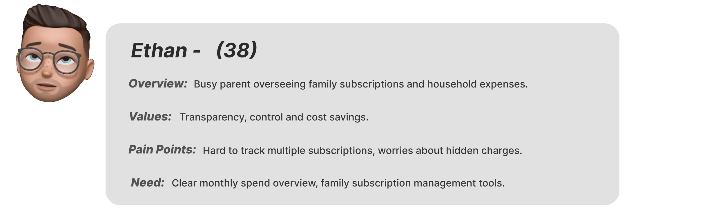
USER PERSONAS

IDEATION
The ideation stage was basically me asking, “does this even make sense?” on repeat until it finally did. This phase was all about shaping how users would move through Droplet, what they’d see first, what actions mattered most, and how to make every screen feel intentional. I focused on the logic and flow behind the experience before worrying about visuals, making sure every interaction had a reason to exist.
MAPPING THE FLOW
Before touching a single pixel, I wanted to see how users would actually move through Droplet, from spotting a sneaky charge to proudly canceling it. So I mapped all of those paths, the little emotional zigzags users take when they’re annoyed, curious, or just trying to feel financially on top of things.
Here’s what’s inside the combined flow:
Onboarding: Quick, light, no financial jargon. Just an intro to Droplet.
Dashboard: Your home base. See all active drips (subscriptions), what’s renewing soon, and where money’s sneaking out.
Add a Subscription: The main bit, straight to the point.
Cancel Subscription: Clean, transparent steps and a little confetti party when you stop a leak.
Set a Reminder: Droplet pings you gently before renewal day, not scolds you after.
View Insights: See total spend, categories, and your “drips stopped” count.

Mapping this out as one big ecosystem helped me spot a few things early:
Too many apps force you into one tunnel. Droplet needed flexible exits and side doors. This flexibility creates a sense of control and discovery, users can navigate based on their mental model rather than being forced through a rigid path.
The cancel and reminder paths overlapped, which made it easier to merge them into a single, smarter screen. This reduces cognitive load and makes the app feel more anticipatory, as if it understands that “cancel” and “remind” are related decisions.
Adding moments of delight (like the confetti celebration) gave users a small dopamine hit for doing something responsible, the design equivalent of a gold star.
WIREFRAMING
This is the part where the plan starts to take shape, but nothing is perfect yet. (and that’s okay)
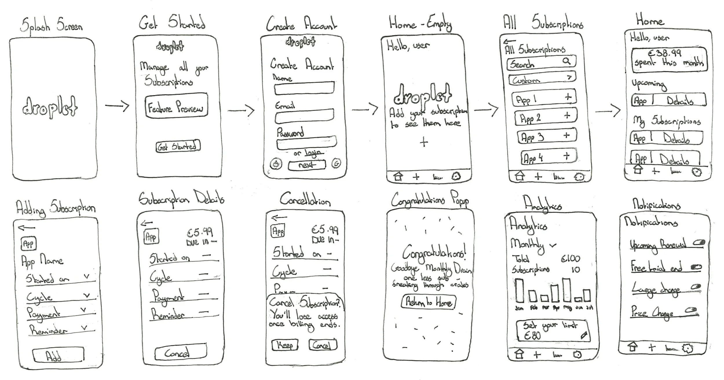
SKETCHED LOW-FIDELITY WIREFRAMES
Once the core idea for Droplet was defined, I jumped straight into low-fidelity wireframes. The goal wasn’t to make anything pretty, it was just to figure out what actually needed to be on screen and how users would move through it. These sketches helped me map out the key interactions: viewing upcoming payments, checking totals, and managing subscriptions without getting lost.
MID-FIDELITY WIREFRAMES
From there, I moved on to mid-fidelity wireframes, essentially translating those early ideas into something more structured which can act as a clear blueprint for layout, hierarchy, and navigation. This version introduced more realistic spacing, labels, and button placements, making it easier to prototype real interactions.
I was able to take these wireframes and turn them into an early clickable prototype which I eventually sent to a few of my interview participants! I asked them to ‘play around with it’, no guidance, just plain exploration. Their feedback helped me spot little friction points early on which could have taken away from a smooth experience. This step helped me polish the experience nice and early before it snowballed into something bigger.
This one is currently under a bit of creative construction! Why not explore some of my polished projects instead?