brand launch design strategy
This project was created as a self-initiated case study to explore how strategic design across multiple touch points can support a successful product and brand launch.
This is a conceptual project created to demonstrate the power of design during a brand or product launch.
It explores how strategy, storytelling, and design decisions come together across digital and physical touchpoints to shape perception, build desire, and turn curiosity into conversion.
For this project, I imagined the launch of a fictional wellness-lifestyle brand founded by Nala, a yoga instructor expanding her world with two new product lines: Matcha and Gymwear. The challenge wasn’t just to “make everything look nice” , it was to actually build a cohesive ecosystem that could support her evolution from individual instructor to emerging lifestyle brand.
A yoga instructor is evolving her personal brand. She’s launching:
✔️ A full website
✔️ A premium matcha line
✔️ A small drop of gymwear
All under a lifestyle umbrella brand.
The deeper challenge:
How do you design a universe that makes people want to step inside?
THE BRIEF
BRAND STRATEGY: FINDING THE SOUL
Before touching visuals, I started with feelings. Who is the world of byNala for? What does it need to communicate? How should it move?
The brand had to feel like a conversation with someone you trust, approachable but aspirational. Yoga can be intimidating; matcha can feel niche; gymwear can feel loud. My job was to bridge all three into a lifestyle that felt approachable and welcoming.
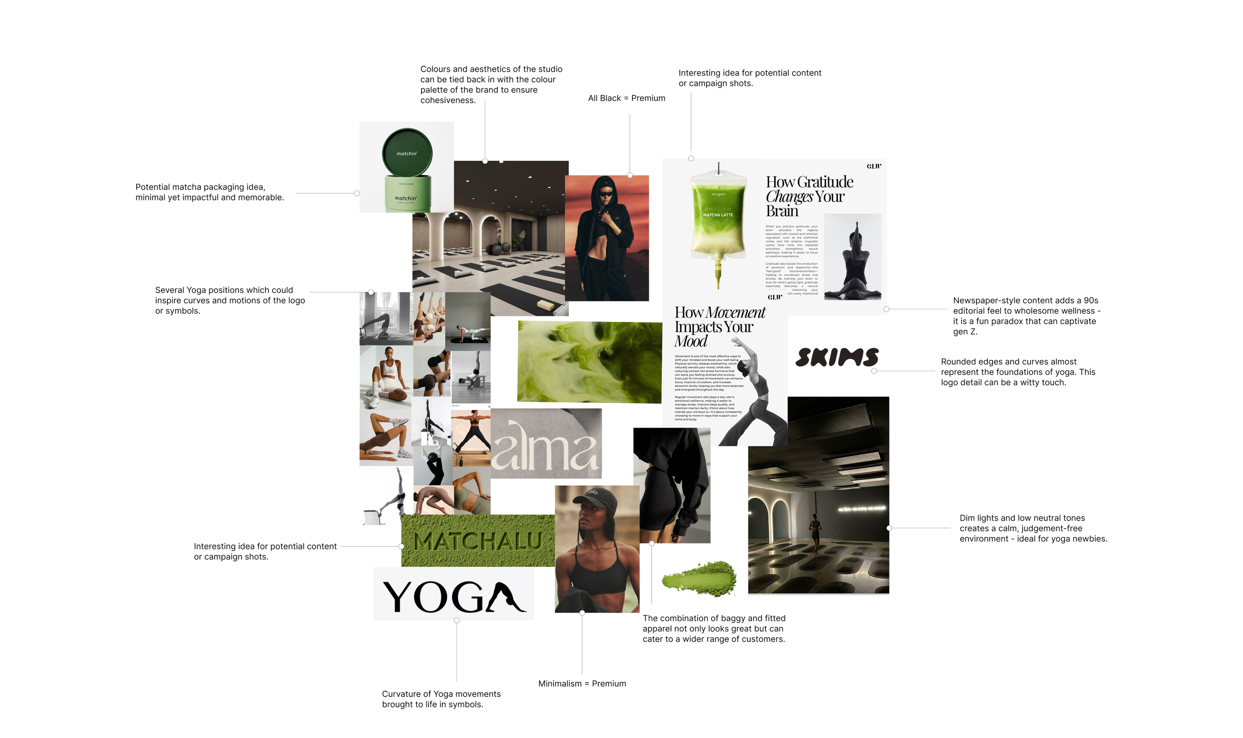
The moodboard became the foundation of the world I wanted to build: dim studio lighting, purposeful curves, premium minimalism and subtle editorial cues.
Everything had a reason:
The neutral palette reflects calm, trust, and accessibility which are the core emotions of wellness.
The rounded typography mirrors the curves of yoga movements, helping the brand feel “in flow.”
Editorial-style layouts bring an unexpected edge that helps the brand feel premium without losing warmth.
Dark, cinematic tones contrast the typical “wellness pastels,” giving byNala an identity that stands out immediately.
The result is a visual direction that is a beautiful paradox of calmness and boldness.
THANK YOU FOR READING!
Wanna see what else I’ve been up to?
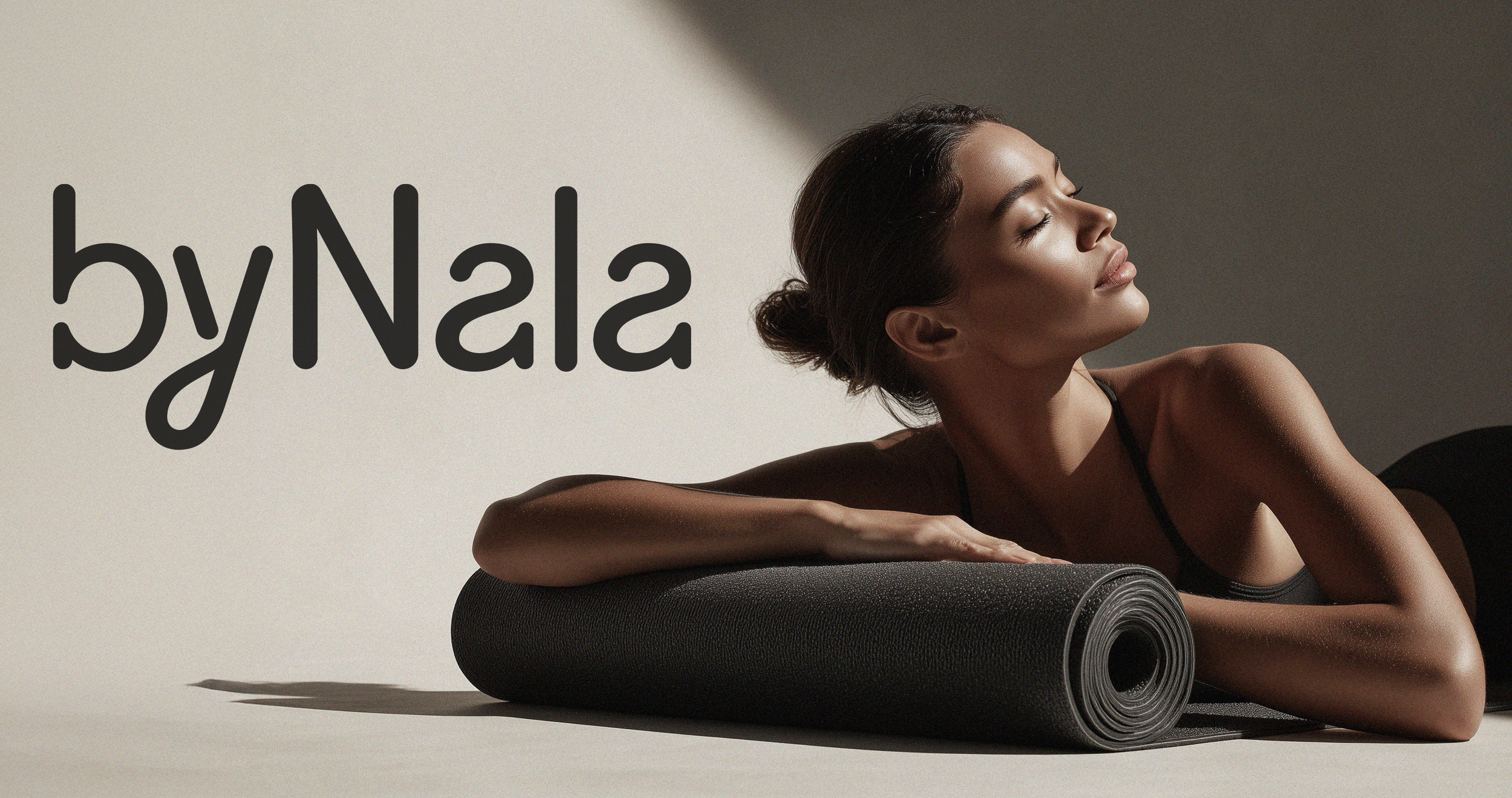
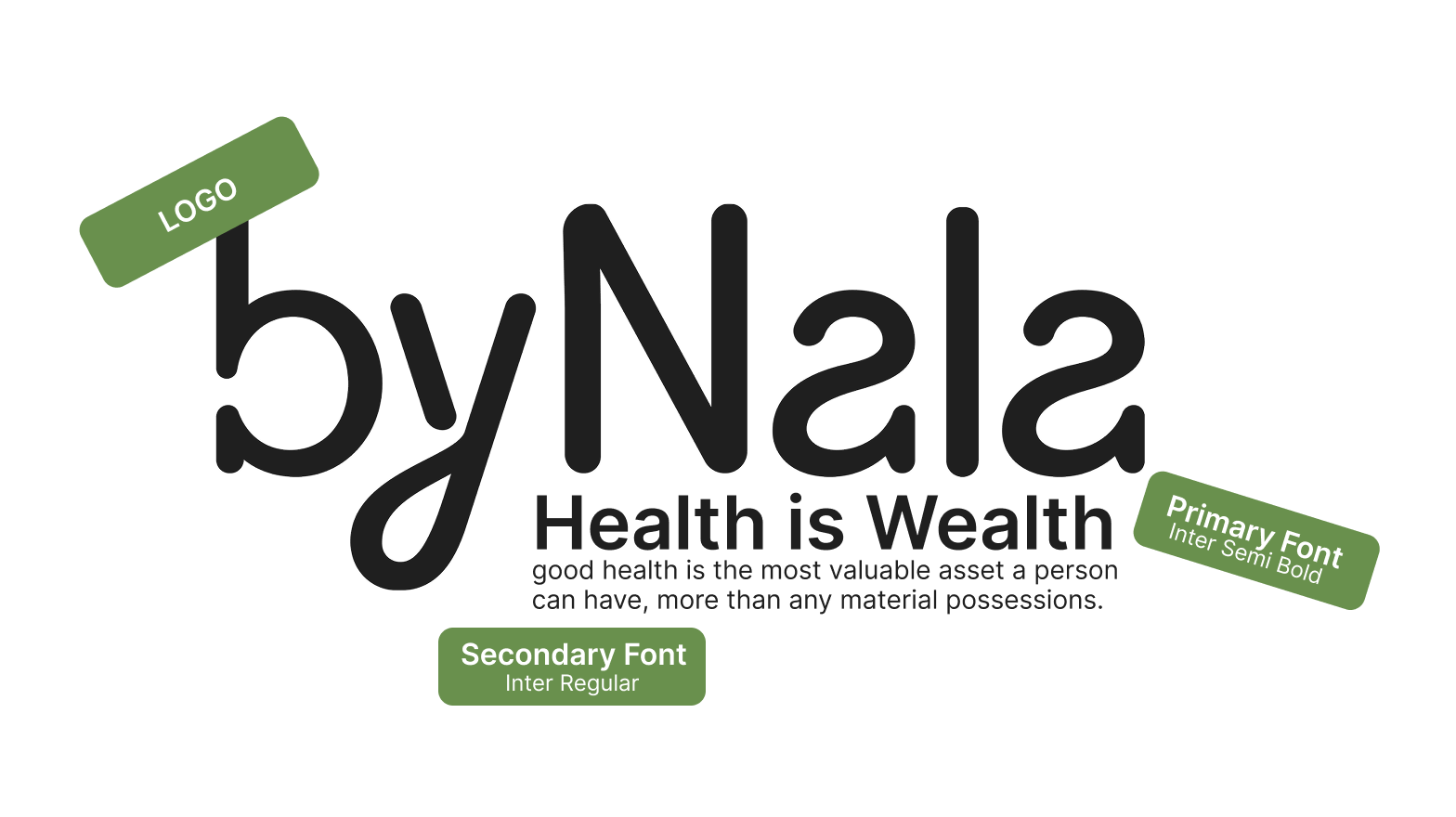
BRAND IDENTITY & LOGO RATIONALE
The byNala wordmark is built around one idea: movement with intention. The rounded strokes echo the shapes and transitions found in yoga, while the clean geometry keeps the brand feeling premium and contemporary. It’s expressive enough to feel human, but structured enough to expand into a full lifestyle ecosystem.
This duality intentionally connects the three pillars of the brand: movement, ritual, and lifestyle.
I wanted the logo to feel like something you’d trust on a yoga mat, admire on a matcha tin, and wear on a hoodie.


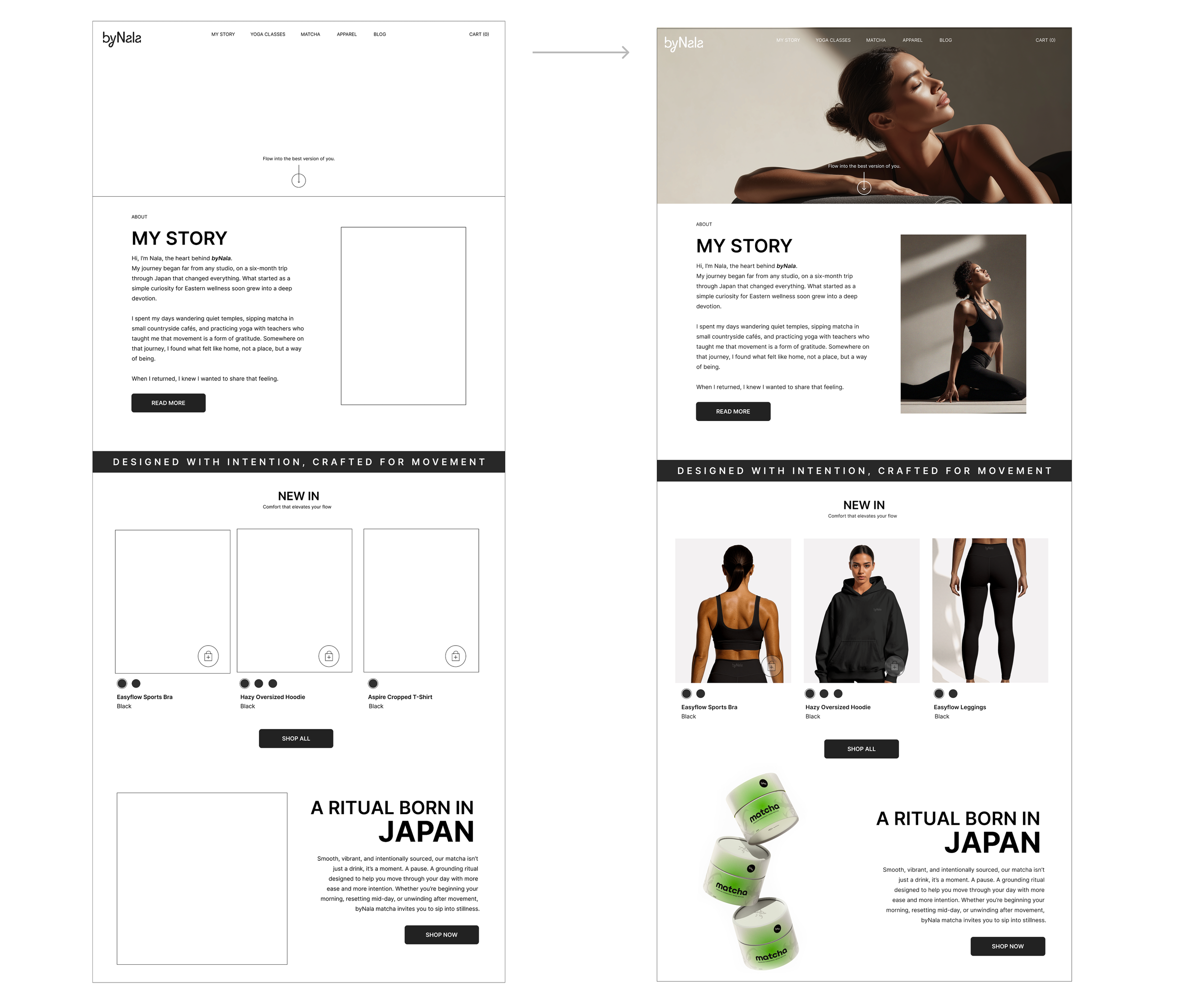
WEBSITE CONCEPT & STRUCTURE
The website is the heart of the launch. It introduces Nala’s world, showcases her new products, and guides users into both the practice and the lifestyle she’s building.
Before jumping into visuals, I mapped out the structure of the byNala website. Because the brand is expanding from yoga classes into matcha and gymwear, the site needed to feel flexible, modular, and easy to navigate, even for a small brand.
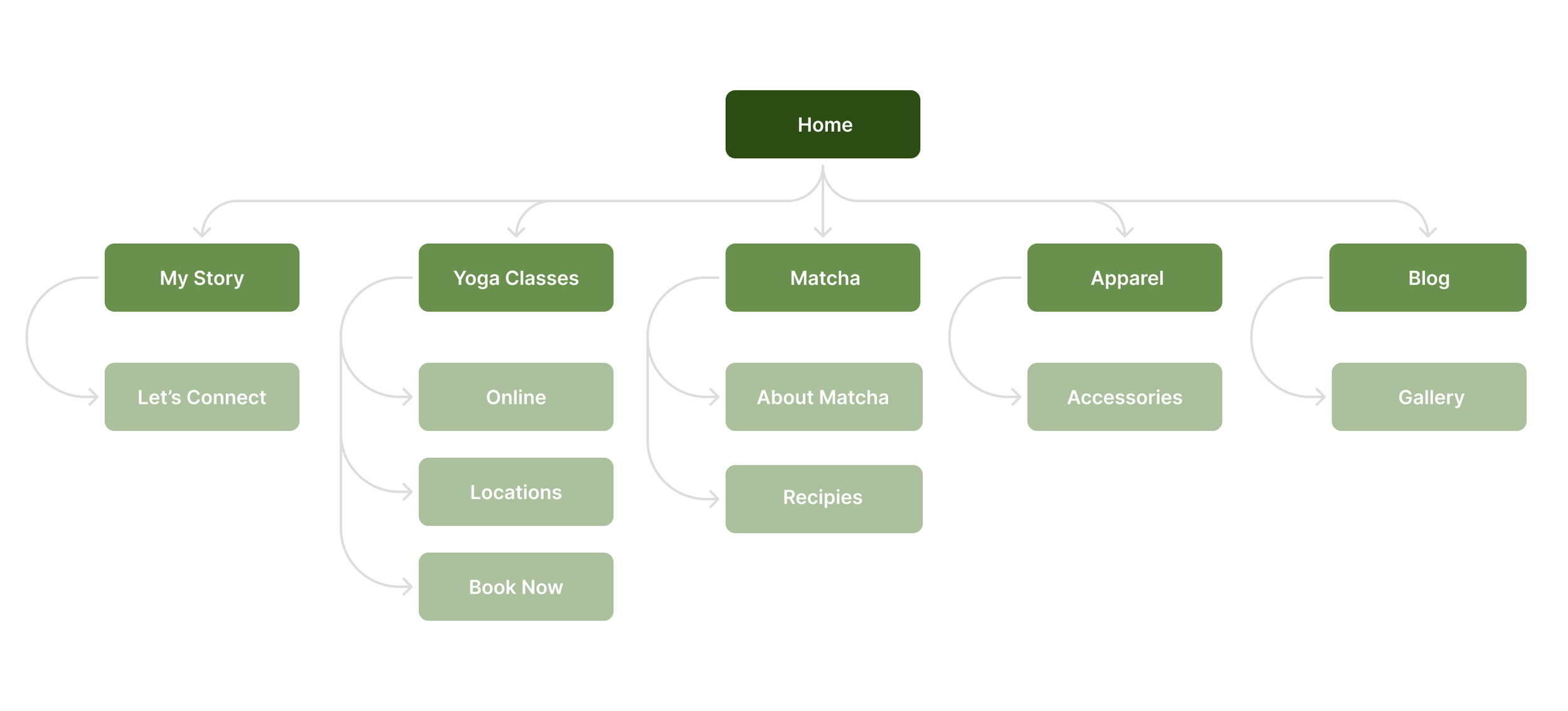
The flow intentionally guides visitors from “Who is Nala?” into “What does she offer?” and finally “How can I join her world?” The website becomes a conversion path disguised as a warm lifestyle experience. Everything is designed to move a user from curiosity → trust → action.

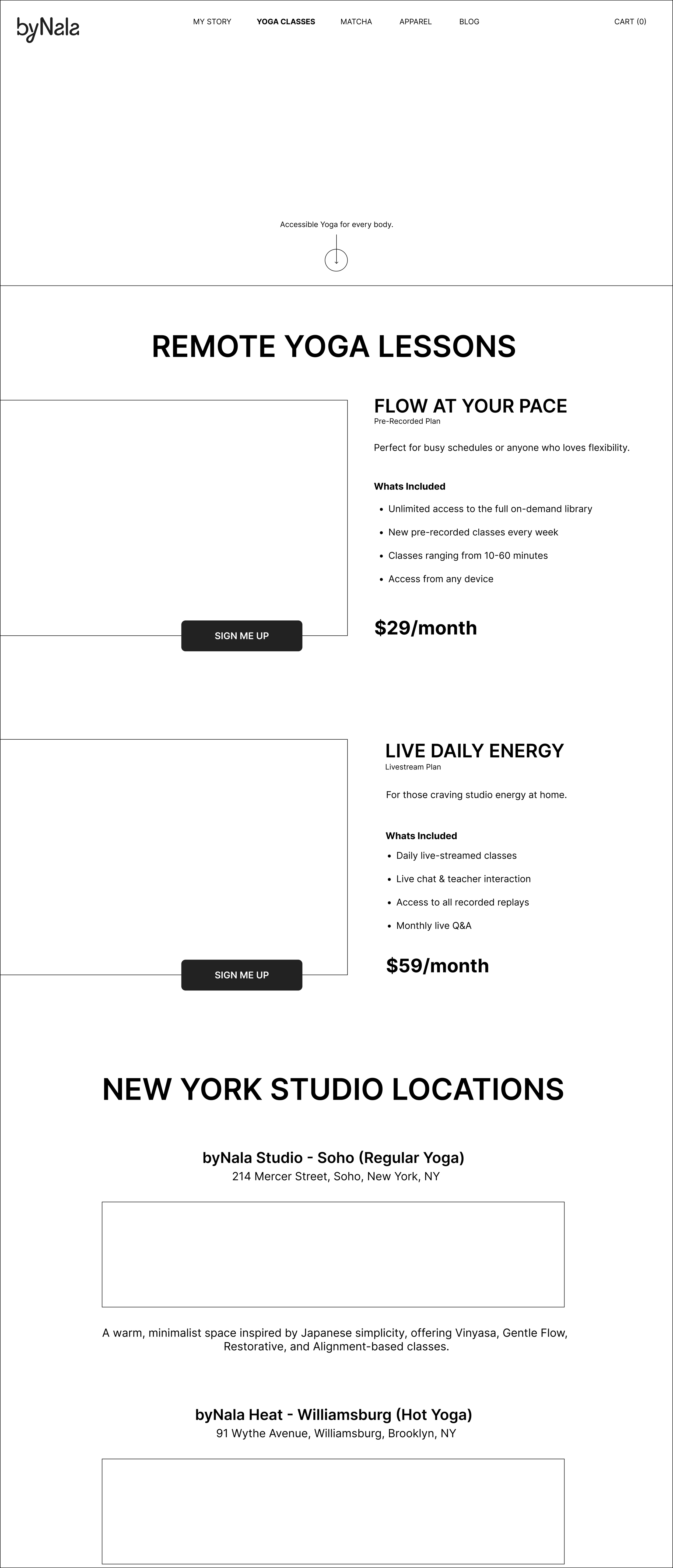
UX Considerations: I kept the website organised into clear sections, predictable patterns, and minimal friction. The layout is clean, the navigation intuitive, and the hierarchy reflects real user priorities (classes → new products → Nala’s world). The tone remains conversational and human throughout to ensure the site feels welcoming and not corporate.
Accessibility Touchpoints: High contrast, descriptive alt text, responsive layout, and clean, semantic headings. Even the matcha and gymwear photography would be captioned clearly, keeping the site inclusive and easy to navigate.
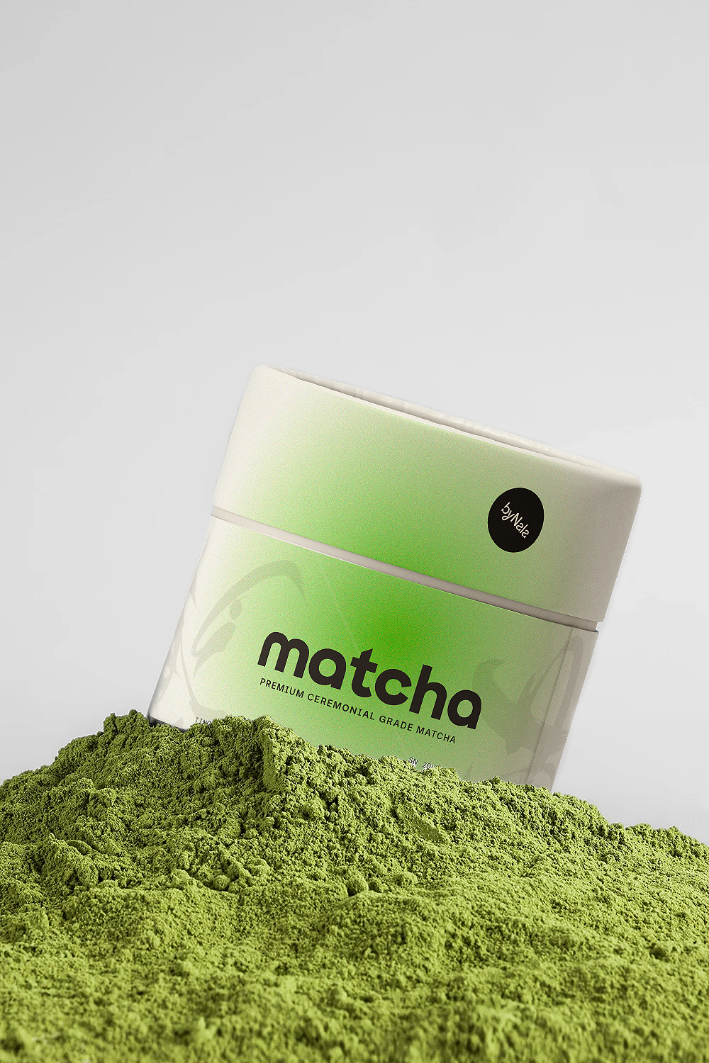
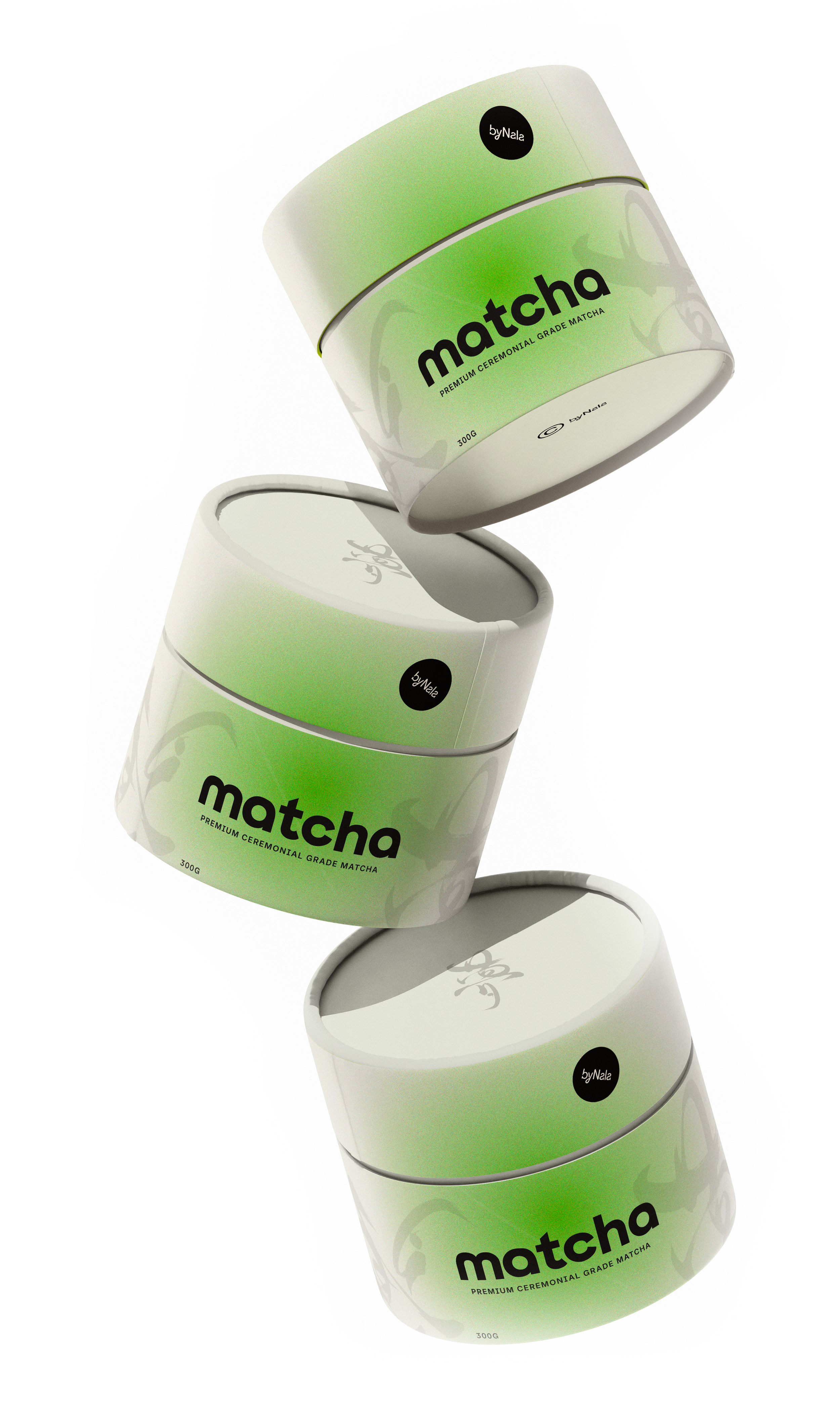
MATCHA PRODUCT CONCEPT
Matcha is inherently ritualistic, it’s calm, slow, grounding. I wanted the packaging to reflect that without leaning into clichés. The design is minimal but rich in tone, using deep greens and clean layouts that evoke focus and clarity.
This product acts as the “entry point” into the byNala universe.
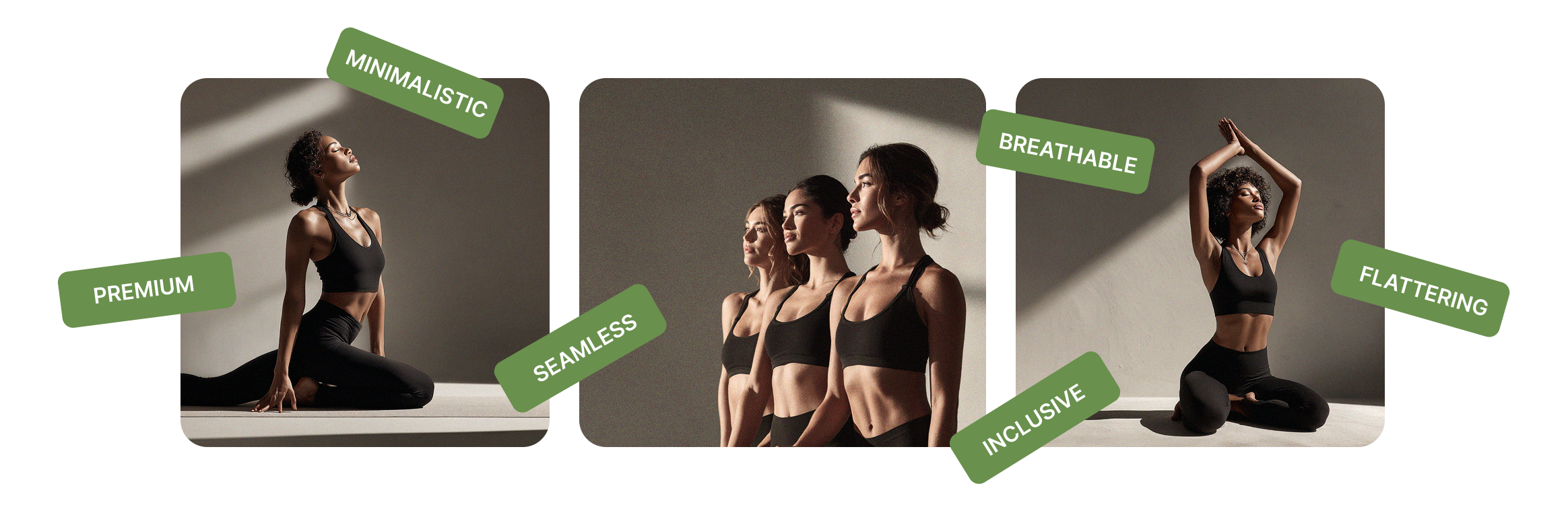
APPAREL LAUNCH CONCEPT
Nala’s apparel needed to exude confidence, with structured silhouettes, darker tones, and content that feels editorial. The design draws inspiration from neutral lounge brands but leans more premium and minimal.
The apparel visuals intentionally echo the yoga studio mood: dim lighting, textures, soft gradients, and body-positive poses that celebrate movement.
This line is designed to make the brand feel scalable, from instructor to lifestyle label.

CONTENT & POSTS
Once the visual language felt solid, I moved on to content creation. My goal here was simple:
Make Nala’s world feel inviting, aspirational, and consistent wherever a customer might meet her.
I created a series of content pieces built around the core idea of calm confidence , the feeling you get after a great yoga session or a really good sip of matcha.
With the help of AI, I was able to bring to life my creative direction concepts for byNala’s studios, photoshoots and apparel. Through doing so, I was able to make the brand come to life fully. Showcasing byNala’s branding with actual unique visuals was the final puzzle piece for this branding project. Everything was designed to feel warm, human, and scroll-stopping without being loud or salesy.

WEBSITE USER INTERFACE
The digital home for the brand’s next chapter.
The website concept brings everything together.
I built a clean, welcoming landing page structured around the brand’s natural rhythm: move, breathe, explore.
The layout prioritises:
– A warm hero section introducing the brand
– Clear blocks for the Yoga offering, Matcha, and Apparel
– A calm, editorial-style approach to imagery
– Simple navigation and strong accessibility choices
– Product-ready sections that could plug into a CMS without friction
The intention here wasn’t just to “make a website.”
It was to show how a brand behaves when its strategy becomes real , in homepage flow, copy tone, and visual hierarchy.
To further demonstrate how easily byNala’s new brand ecosystem translates across all mediums, an additional website page was crafted. This is where we see the importance of coherence.

CONCLUSION
Design transforms ideas into momentum.
This conceptual project shows how thoughtful, human-centred design and strategic content can take a small, personal brand and prepare it for a much bigger stage. Every choice, from the logo curves to the website layout was made to support clarity, connection, and conversion.
And ultimately, that’s the story here: design isn’t just what a brand looks like on launch day, it’s how a brand builds trust, earns attention, and grows.